Gumball Machine
Package Re-Design
I have always loved the idea of owning a gumball machine. Instead of it’s classic red, I wanted one in black. Well, dreams do come true because I got one for Christmas!
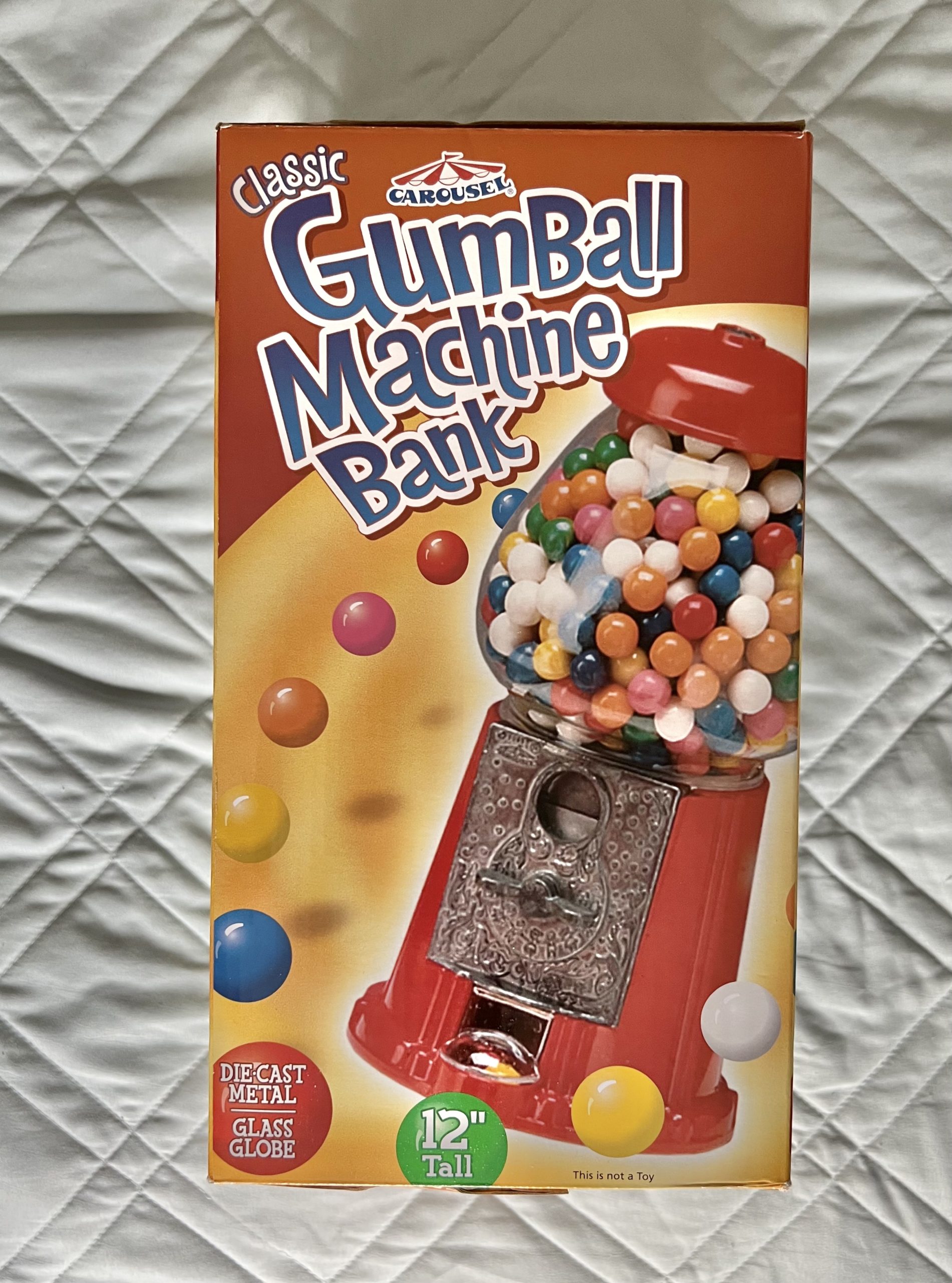
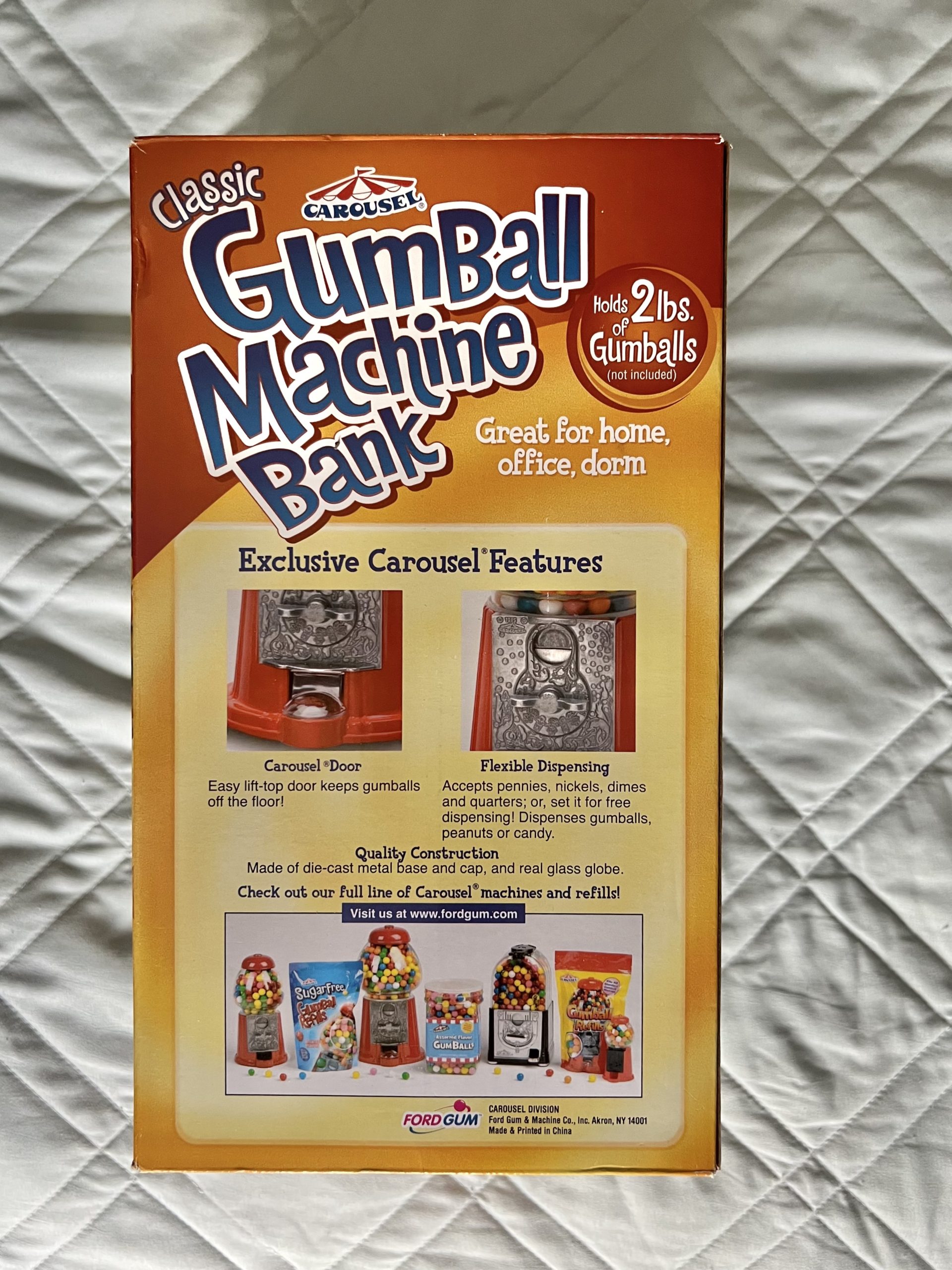
The box my gumball machine came in had a very dated design. Also three sides of the box were the same, and it felt like a waste of space. After looking at it I thought, “Hmmm, I could make this look better.”
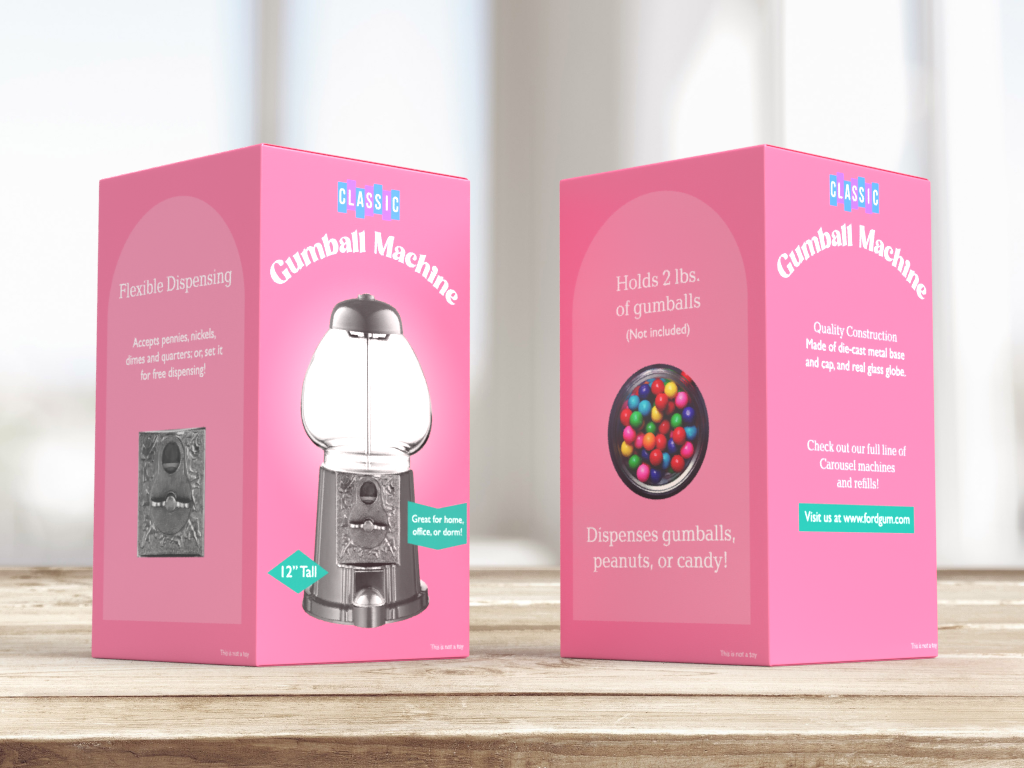
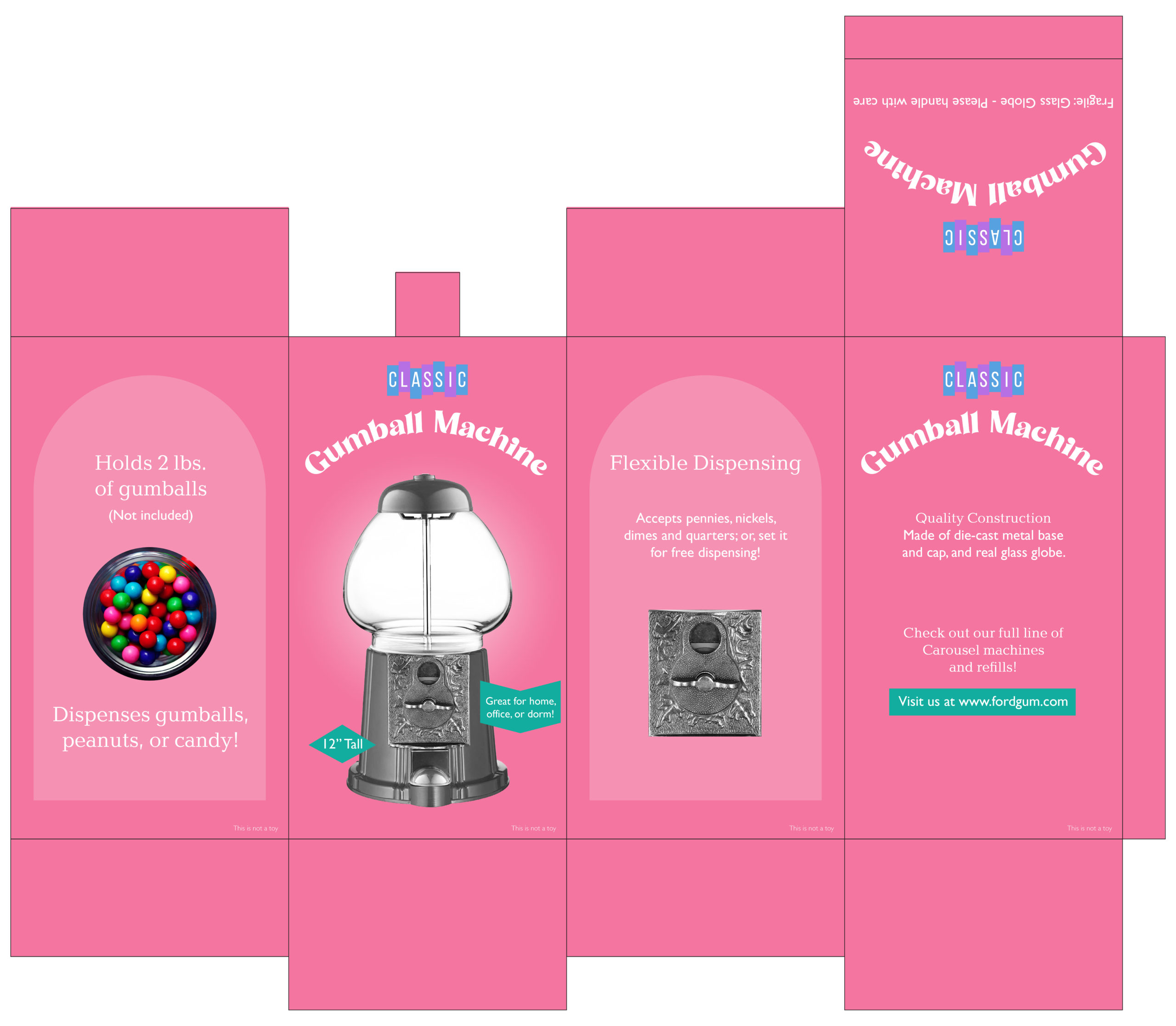
So, I hit the drawing board. I decided to make the gumball machine a dark gray like mine. I went with a pink background because that color felt right for gumballs. I also took the information on the back of the box and dispersed it across two of the sides on the box.
The design was made using Adobe Illustrator. The mock up was created using Adobe Dimension.
