by laurenawagner | Jul 20, 2018
Fortune Tellers for Today
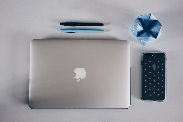
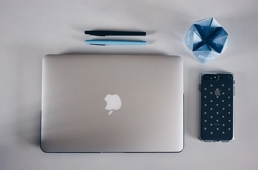
Back when I was considering what to do for my senior project I was joking with my friend about making a book of fortune tellers. They said what’s a fortune teller and I explained it and they when oh you mean a cootie catcher? So no matter what you call them I decided to make a few but I kept them with the theme of being an adult. You know millennials are into nostalgia, and I mean what’s more nostalgic than a cootie catcher. So I created six different cootie catchers. These are available for you to print at home. (I’m a big fan of printables. I know. You’re welcome.)
They include: Excuses why you’re late for work, Magic Eight Ball, College Senior, Ways to say No, Ways to say Yes, and Make your own! They also look totally cute on your desk.

Excuses Why You’re Late
Magic Eight Ball
College Senior
Different ways to say No
Different ways to say Yes
Create Your Own

by laurenawagner | Jun 6, 2018
Design:
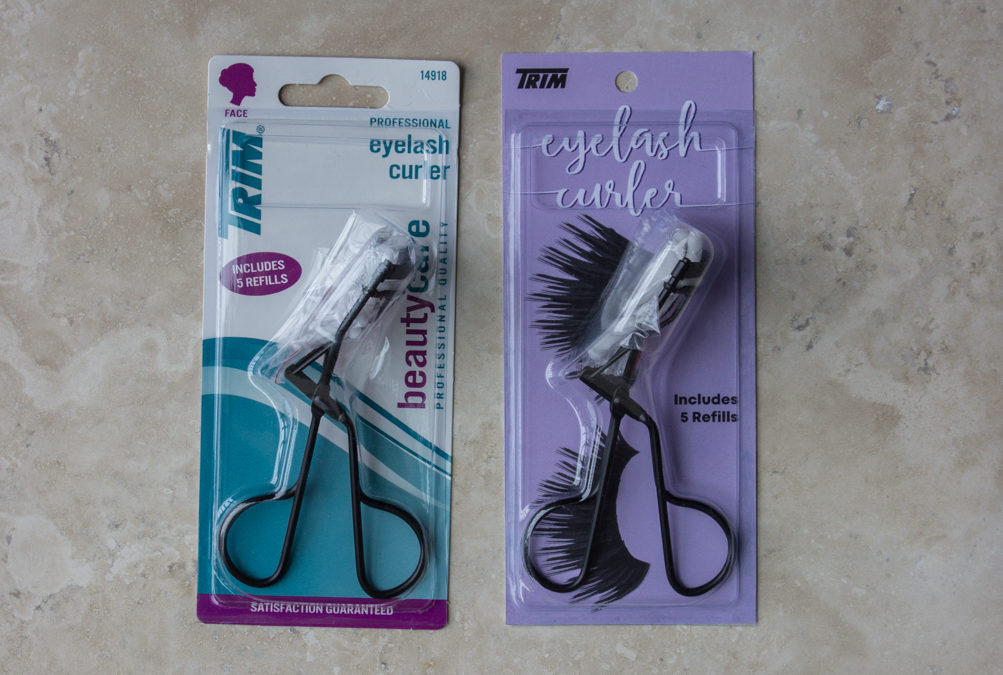
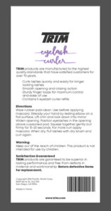
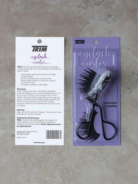
For this project, my goal was to redesign an ugly package. I never really paid much attention to packaging until this project. It’s amazing to see how many ugly packages are out there. As I was looking I discovered that all eyelash curlers had ugly packaging. All of them. If you don’t believe me check out Walmart’s eyelash curler selection here. I ended up picking Trim’s eyelash curler because the package was very dated. I’m actually pretty sure that Microsoft had a power point presentation that looked like this in the early 2000s.

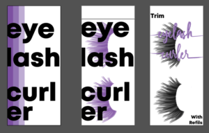
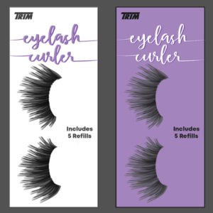
Once I picked my product it was time to do some research. I started a Pinterest board dedicated to pretty packaging. I also went to Sephora to see how makeup was being packaged. When I was at Sephora I realized a few things. All makeup packaging is either black and white or it’s shiny (metallic or iridescent). From this I knew I wanted to do something different from the trend. I did some sketching and then I dived right into Illustrator. I came up with two different ideas.

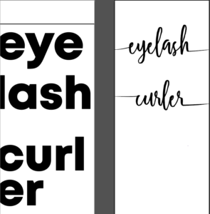
After I got my basic typography down I then added some design elements to it.

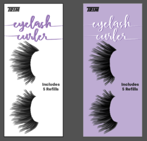
I really liked the look of the eyelashes. I thought it was a good idea to put them on the package because that’s the reason for the product. I also figured the cursive would be a better idea since the eyelash curler lays on top of the package. I knew that my design needed some work because there wasn’t a lot of contrast between the text and the lashes. I then realized that the eyelash curler would cover up the words. All of this lead me to the next design.


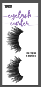
After this I got critiques. One of my peers suggested making the background purple. I did that and then I was torn. I knew I had to fix the eyelashes on the purple so I copied the shape and put a second layer on top of the lashes to help make more contrast. I also changed the purple to a lighter shade to help add more contrast between the lashes.

I thought they both looked good, and I decided to hold a poll on Instagram. From this I learned that initially people liked white but once they saw a rough draft of the product white and purple were split 50-50.

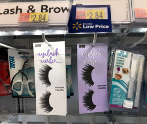
From the poll, I couldn’t make up my mind so I went to Walmart and I put the sample prints up in the store to see if that would sway my opinion.

As I was looking at the prints in Walmart I realized how all of the packaging was white and purple stood out more. It also broke the trend that all other makeup packaging was following. Once I made that decision it was time to print.
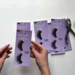
I went to Alpha Graphics here in Rexburg to print. While I was there the employee informed me that their printer was having an error and it could not be fixed until the technician came in on Monday. He did tell me he could sell me this splotchy print for 40% off. It was bad there were white dots all over the purple. I then asked him about any other print places I could go and he directed me to Speedy Cps in Rigby the next city over. I went there and their printer was working great. I got a lot of copies and it was time to assemble the product.
Assembly:
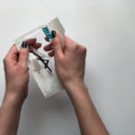
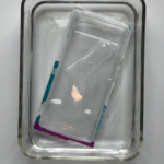
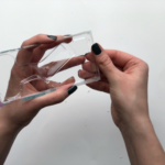
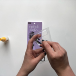
- First I had to open the package.

2. I then soaked the package in water to help get rid of the paper.

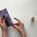
3. I then rubbed some of the paper off.

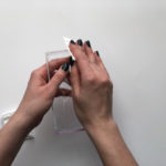
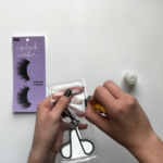
4. After that I used nail polish remover to get rid of the excess ink and some glue.

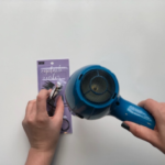
5. I then used a hair dryer to dry the package and get rid of all excess lint.

6. I then had to pick out a sheet to be the background.

7. Once that was chosen I had to hole punch the paper so it could hang in the store.

8. After that I had to put the product back into the plastic packaging.

9. I then applied glue to the edges of the package.

10. I attached the plastic and the paper.

11. I then used a hairdryer to dry the glue.

Everything went well. I ended up putting a little too much glue on the plastic so it looked a little weird on the edges but overall I think it looks great, especially when compared to the original.


by laurenawagner | Jun 5, 2018
Senior Project
In order to graduate as a communication major all students have to do a senior project. This project must total a minimum of 50 hours and can be anything related to communication. I felt the need to work on graphic design skills, and do something that was relevant. I struggled to come up with an idea. Most students who are visual typically make a cookbook or they go rebrand a company for them. Those are nice ideas but I wanted to do something that hadn’t been done before. After weeks of thinking about this I finally had an idea! SNAPCHAT! For the record this was in January of 2018 aka before the bad update and all of the controversy, but Snapchat was a popular social media app. Snapchat also anyone to upload filters for free if they are for a common area like parks or cities. They also have moment filters so any popular event you are also allowed to make snapchat filters for. The part that got me was the word FREE. Broke college student can design filters for free? Count me in.
Once I had my project set I needed to work on a game plan. I figured I would create Snapchat filters for cities in South Eastern Idaho following I-15 and Highway 20 from Malad to Island Park. In order to create these filters I would do research on the city such as when they were found and the various things that make them unique. After research I would do some sketching and then design up a filter.
After I completed the city filters I then decided to make 10 event filters. Snapchat allows you to create moment filters that can be any event. So I came up with a list of things that I feel like are common. This includes things like midnight snack, girls night, congratulations, to master chef.
Once all of these snap filters were designed I knew I had to create mock ups so people knew what I was talking about. I went around Idaho and took photos that looked like they would be something that a regular snapchatter would use. I then found an iPhone X mockup to put these snapchats into.
Once all of this was created I then put everything it into a booklet so it would be easy to showcase. You can see it here or below!
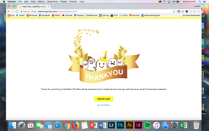
The final step in the process was to submit my designs to Snapchat! Sadly none of my designs were accepted. I’m not sure if it was because they were submitted during all of the controversy or if they didn’t like them. Either way I learned a lot from it. I was able to use Adobe Illustrator, Photoshop and InDesign which really just helped solidify my skills. I was also able to create designs that were applicable to the place/event. I also learned more about Snapchat. Overall this project was lots of fun and it helped me graduate!


by laurenawagner | Feb 3, 2018
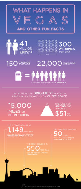
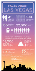
Facts about Las Vegas

The Process
I created this infographic because I’m from Las Vegas. I love the city and I know that lots of other people enjoy Las Vegas as well.
Background:
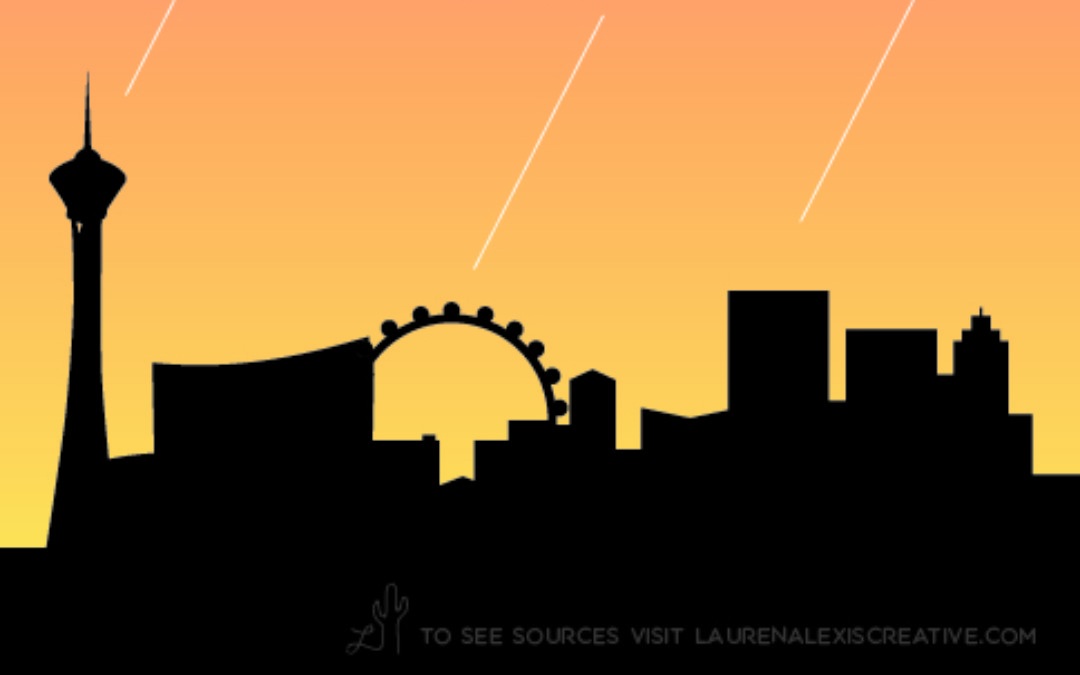
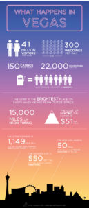
I knew that immediately I wanted to make my infographic a sunset, because Las Vegas Sunsets are gorgeous and the real party starts when it’s dark. In order to make the sunset stand out I knew that a silhouette would work the best. Creating a silhouette was rough because there are very few pictures of the Las Vegas Skyline that are straight on. I was determined and went to work in Adobe Illustrator.


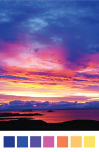
My colors were inspired from a sunset image on google
Title:
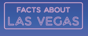
Once I had my background figured out I then went to work on the title. I figured it would be fun to create a Neon Light look because nothing else says vegas more than that! I mean the city has 15,000 miles of neon tubing in it. I watched this amazing tutorial to help me make my neon dreams a reality. You can see it by clicking here.

Information:
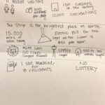
After that the real sketching began. I needed to figure out exactly what information I wanted to portray and what was the best way to do so. I also had to come up with some Icons to help portray my ideas.

There was lots of revision from that point. It was a very rough sketch.
Rough Draft:

I got all of my information together, but it was too clustered. You also couldn’t really see the neon lights, and many other problems. I got lots of critique and kept working. The hardest part was exporting this file. When I exported it the first time I didn’t change the color value so it was on CMYK. It made the colors so neon that my infographic looked wrong. It took me a while to figure out that I needed to change everything to RGB. Once I did that the colors got better.

I then got more critique, and that brings us to the final image from the top.
Sources
https://www.movoto.com/guide/las-vegas-nv/las-vegas-facts/
https://downtown.vegas/play/fun-facts/
http://www.readersdigest.ca/travel/world/9-las-vegas-fun-facts/view-all/
If you want to see more inspiration check out my pinterest board here.

by laurenawagner | Sep 25, 2017
Design Thinking an Idea to Help End Human Trafficking
A few semesters ago I took a class on Design Thinking. For those of you who don’t know what that is it is a different way to go about solving a problem. The idea is to used human centered design to help solve a problem. You follow steps to help you reach a solution
- Empathy (understanding the problem from every angle)
- Define (based off of your knowledge you define what the problem is)
- Ideate (you come up with solutions to your defined problem)
- Prototype (come up with an smaple/example of your idea)
- Test (go test your prototype and see how it works out)
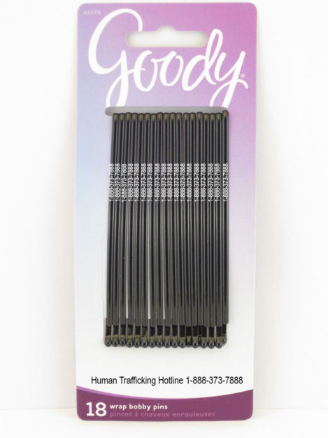
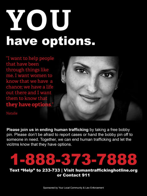
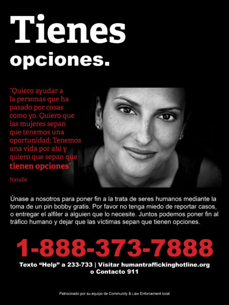
By laying it out in this manner it sounds easy but sometimes you have to repeat steps. It’s quite the process. Anyways my group went through this whole process and the idea I came up with, that the group ended up going with was to put the human trafficking hotline number onto bobby pins. We would have these bobby pins available for free in public restrooms, and we would have posters explaining what we were doing on the inside of the stall doors so victims would have the opportunity to read them.
The reason we went with bobby pins is because they are small, easy to hide, and are completely useful (especially if you need to pick a lock). Now we didn’t completely figure out all the logistics behind how we would pay for the bobby pins but I felt like this idea was too good not to share.
Anyways, I designed the prototype photos and posters and here they are. I did not take any of the photos posted. I did edit the photos shown.


 Loading...
 Loading...
 Loading...
 Loading...
 Loading...
 Loading...
