by laurenawagner | Jul 12, 2017
Making a Skeuomorphic Swatch
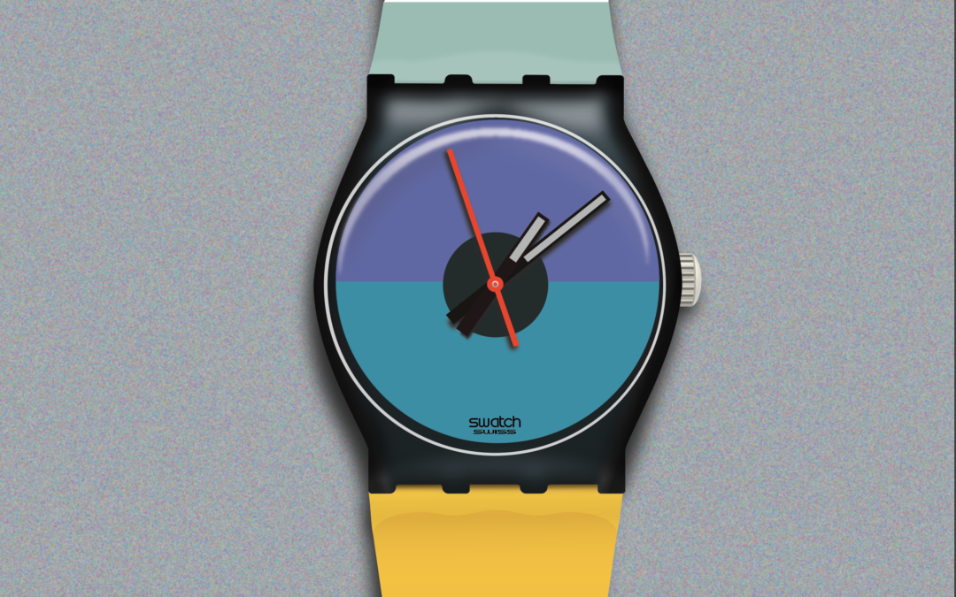
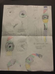
This was quite the project, but I’m excited to share with you what I’ve made! In order to get started I had to pick a watch, and I picked St. Catherine Point Swatch from 1988. I love this watch because I really like the colors, the design, and I’ve been obsessed with Swatches for a while. Anyways, once I picked my swatch it was time to sketch. Once I felt comfortable with my watch it was time to take it to illustrator. 
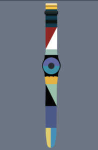
Say Hello to the beginning of my swatch:

Once I had the basic shapes I began making the swatch look “photo realistic”. I started with the yellow band at the top.

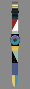
I then went on to add in other parts of the watch including the buckle, and watch face. I also tried to add some shading to the bottom yellow chunk as well.

All of the images above were made the first week. The rest of these photos were done the second week. Anyways, my focus became making the watch look photo realistic, or in other words skeuomorphic. I visited with Brother Kerr and he gave me some great tips on how to fix the buckle, and watch face. Which then brought me to this.

I then thought that this needed some shadow and that would make it look realistic. So I I created shadow, and then posted it for my peers to review, because I thought this was pretty good.

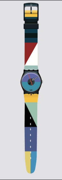
After I posted it I got some feedback and realized that I wasn’t done. I fixed the shadows, added a texture to the background to make it look more realistic, and then fixed my highlights to make them look less blue.

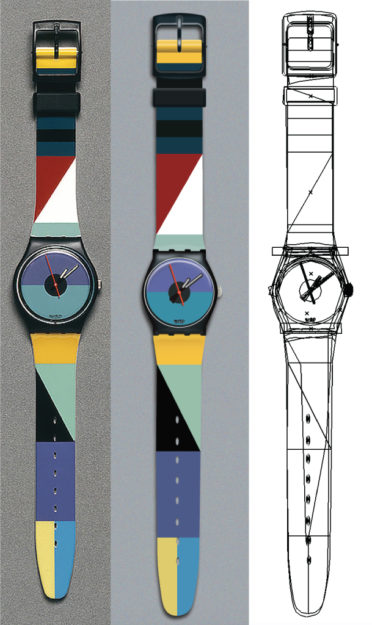
Here’s the original Swatch, my vector, and the paths to prove this is a vector. 
I originally posted this at http://vectorpaths.com/st-catherine-point-swatch/
by laurenawagner | Jul 12, 2017
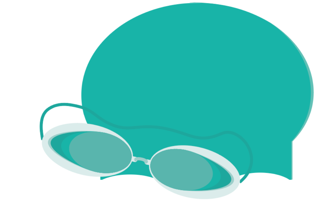
Vector Icons of Items used for Swimming
I decided to create icons of something that I love, and that is swimming! I did competitive swim for all four years of high school. It was a big part of my life and is still one of my favorite activities.
Brainstorm:
The very first thing I did for this project was come up with a list of all the items I used to swim, or were found in my swim bag. After I wrote that list down I picked the twelve most important items, then I sketched six of them.
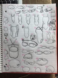
Draft:
Once I figured out what I was drawing it was time to draw them on the computer. I struggled at first because I am new to Adobe Illustrator, but after many many failed attempts I came up with these lovely icons.
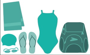
As you can they are a little rough. Especially, that Speedo backpack. If you have never seen a speedo backpack just know that they are a weird shape and when you see one from the front they are very “frumpy” and not easy to draw. Click here to see what I’m talking about.
Anyways, I kept drawing and added a few more items. I was too overwhelmed to fix the backpack.
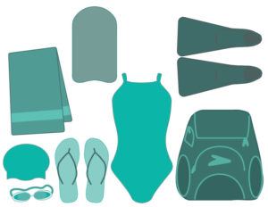
I finished drawing all twelve and then I went back and fixed a few problems. This included the colors, the arrangement of the items. I then realized there were problems I didn’t know how to fix, as in the backpack, the towel, and the fins. So I went to my professor Cory Kerr to ask for help. He gave me some great advice, and I knew what I needed to do. He told me to add shadow to my icons, and I think it helped. I also came to the conclusion that I couldn’t draw the backpack so I decided to change it to a speedo instead.
Final:
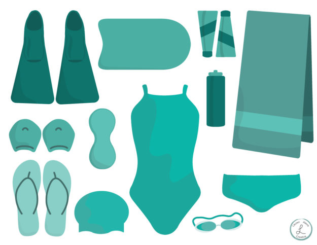
Overall I’m really pleased with how these turned out! It was hard work but now I know how to use most of the tools in Illustrator. For all of you non competitive swimmers out there these are Fins, Kick Board, Shampoo & Conditioner, Towel, Hand Paddles, Pull Buoy, Womens Competition Swimsuit, Water bottle, Flip Flops, Swim Cap, Goggles, and a Speedo.
I originally posted this at http://vectorpaths.com/swim-gear-icon-set/

by laurenawagner | Mar 29, 2017
A fun way to showcase your work
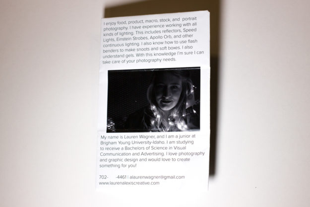
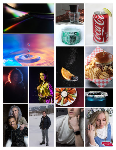
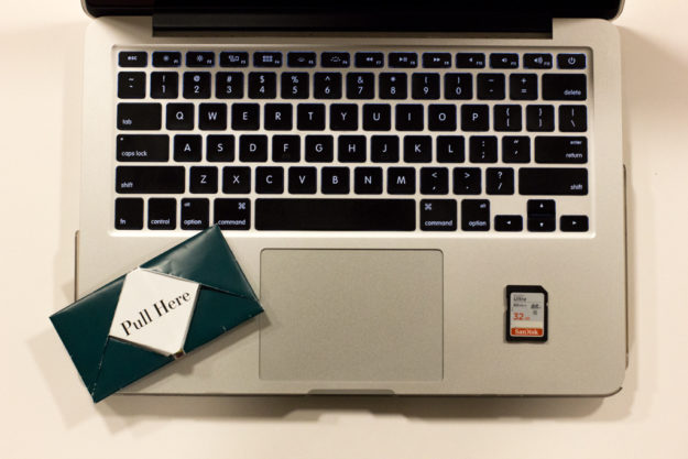
Hello! I am Lauren Wagner and I am a junior here at Brigham Young University-Idaho. I am studying communication and it has been one of the best decisions I have ever made. I love photography and graphic design and this degree is a combination of that. Communications is also great because there are endless possibilities, and it allows me to push myself.
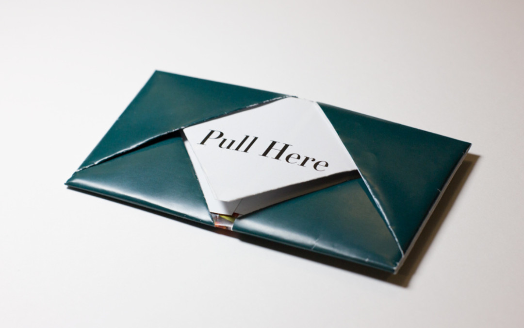
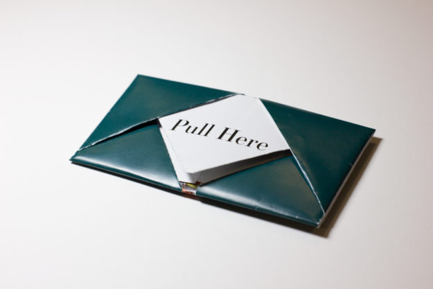
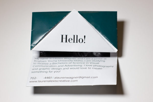
For my resume handout I decided to create a note. It folds up small and is easy to pass along. I learned how to fold this when I was in middle school so I am happy that something useful came from those years. I was actually surprised at how complicated the design of this was. The process began with a blank piece of paper. I then colored and marked it to figure out what folded parts show when the page was laid flat. Then I had to figure out the shapes in InDesign. After a few rough drafts I am pleased to present my final product to you. If you like what you see please feel free to contact me. I would love to create something for you.


by laurenawagner | Jan 28, 2017
The Process of Remaking a Movie Poster
Do you ever love a movie so much that you want to be in it? Well, that’s what inspired me to remake this movie poster.
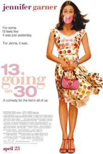
13 Going on 30 is an early 2000 classic starring Jennifer Garner. It is a fun movie, and I relate to it a lot.
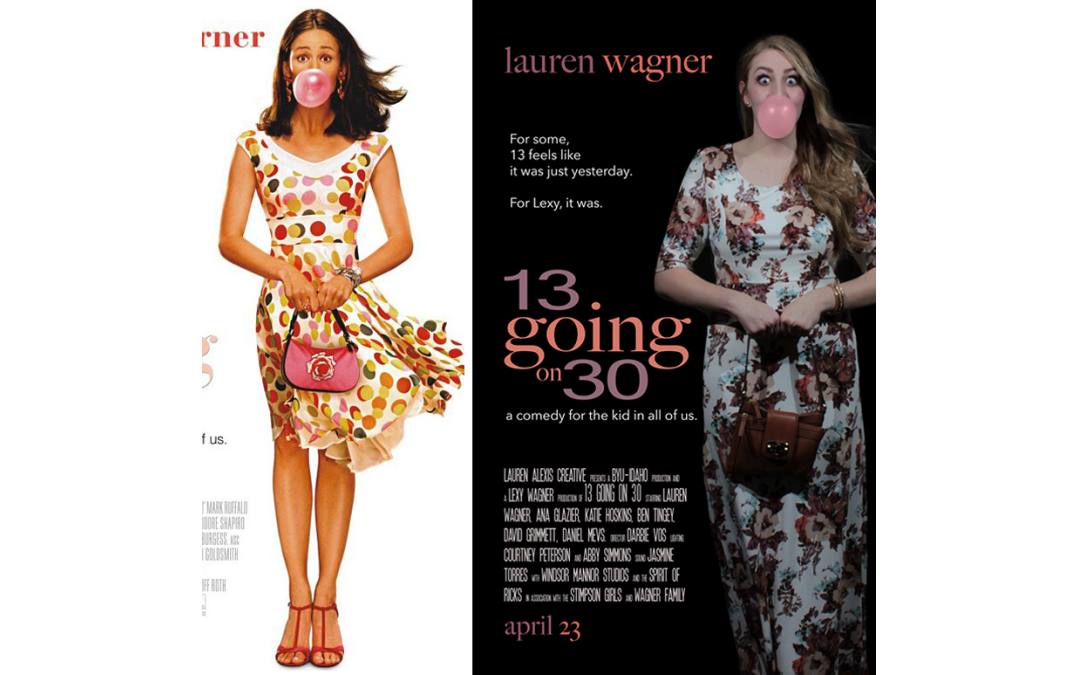
First I had to look at the original movie poster (featured below). I looked at the lighting, the pose, the title, ect. Then I started to think about how I could recreate this. I looked through my closet and found a dress that would be flowy, and then I bought some gum. Which lead to the photo shoot. I knew that I was going to take the background out of the original image so I set up the shot in my living room. I had a fan plugged in laying on the floor at an angle to make my dress blow. I had a roommate with a hair dryer blowing my hair, and two of my other roommates were standing on chairs holding some speedlights and angling them at me. My camera was set up on a tripod with a timer, and there was lots of running back and forth. The hardest part of the whole shoot was blowing the bubble gum. It is hard to blow a perfect bubble, and my roommates joking around did not help at all. On a side note, I might actually hate the taste of bubble gum now.
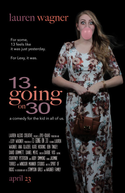
After the perfect bubble was finally blown and captured on camera (featured below) I took the image to Adobe photoshop. Here I lightened the image a little, changed the color of the gum because it was dull, and I removed the background. Since my dress was white, I figured the image would look better on a black background. I then went into Adobe Illustrator and re-created the logo. I picked colors that were similar to the original poster, but also matched my dress. Then I went back into photoshop and put it all together.


Original Photo

Original Movie Poster
If you want to see some other cool movie poster remakes then you should click here.
