by laurenawagner | Feb 25, 2017
Light Painting People & Drawing
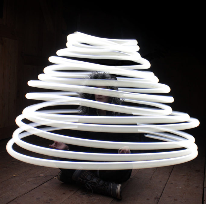
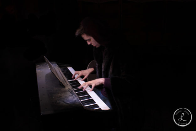
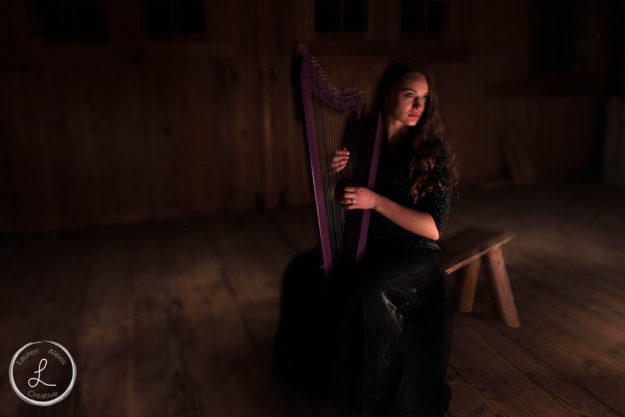
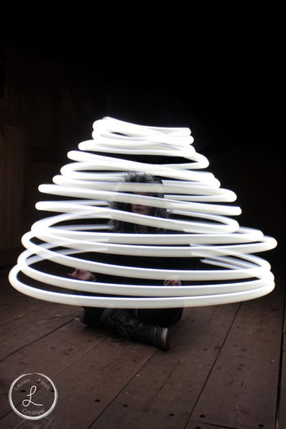
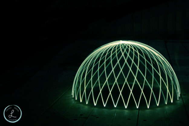
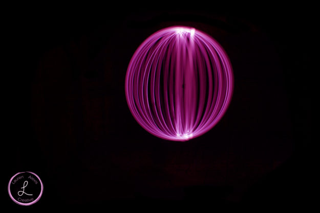
Light painting is great because you get to control light and make it do anything you want. Once you understand the basic principles of light painting you truly have no limits. You can light paint places such as the interior or exterior of a building. You can light paint people (just make sure they hold very still) or you can even use the light to draw. This could look like orbs, half orbs (which are included in this post) or words and pictures. You can also combine different techniques to get interesting photos. Some ideas might include faux bokeh, or using the tools to make orbs to light up a portrait. If you want some more inspiration click here.


by laurenawagner | Feb 9, 2017
Creating Textured Portraits using Photoshop
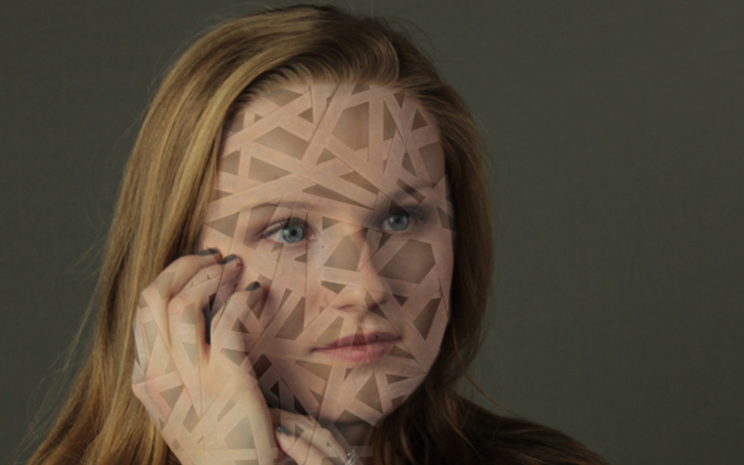
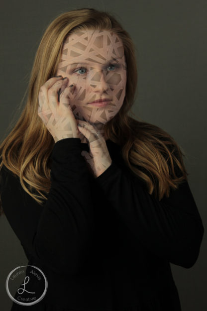
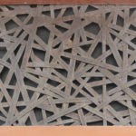
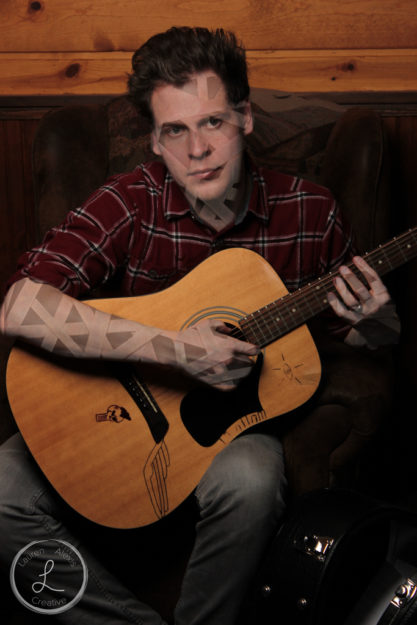
For this assignment I went to this website and downloaded a texture that I liked. I found some portraits that I liked and then I opened them in Photoshop. I then placed the texture I downloaded onto the image and used a layer mask to edit out the parts of the texture I didn’t want to show. From that I got some cool results.


Texture

Original Photo


Texture

Original Photo

by laurenawagner | Feb 9, 2017
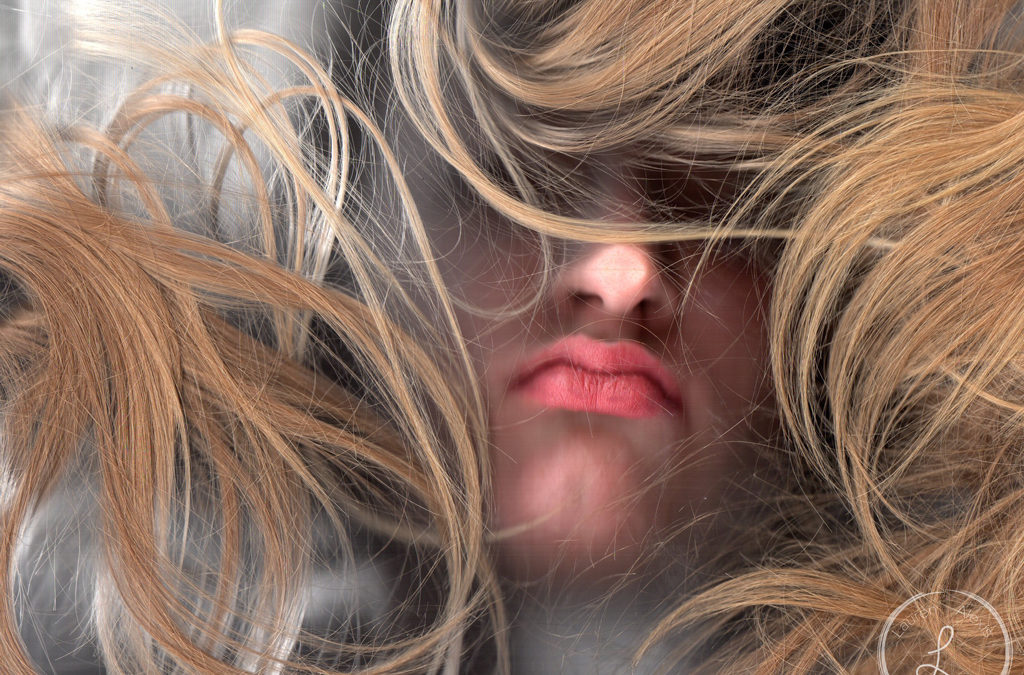
How to use a scanner to create photography
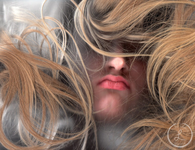
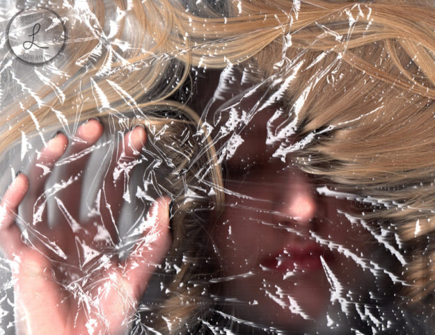
This was a different, yet fun shoot. Before you begin scanning I highly recommend you look up some examples first. I found this cool website with a bunch of different techniques and you should check it out by clicking here. Once you have an idea of what scanography is it’s time to set up. Hook up your computer to a scanner and set up your shot. It is important to remember that you need to hold very still and to hold your breath so the glass doesn’t get foggy. Aside from that I recommend you get as creative as possible!

I was inspired while I was getting ready. Here are the products I use every day


Then I wondered what it would look like if I put shrink wrap on the scanner. I like the texture this gave the photo

by laurenawagner | Jan 28, 2017
The Process of Remaking a Movie Poster
Do you ever love a movie so much that you want to be in it? Well, that’s what inspired me to remake this movie poster.
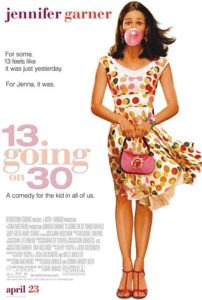
13 Going on 30 is an early 2000 classic starring Jennifer Garner. It is a fun movie, and I relate to it a lot.
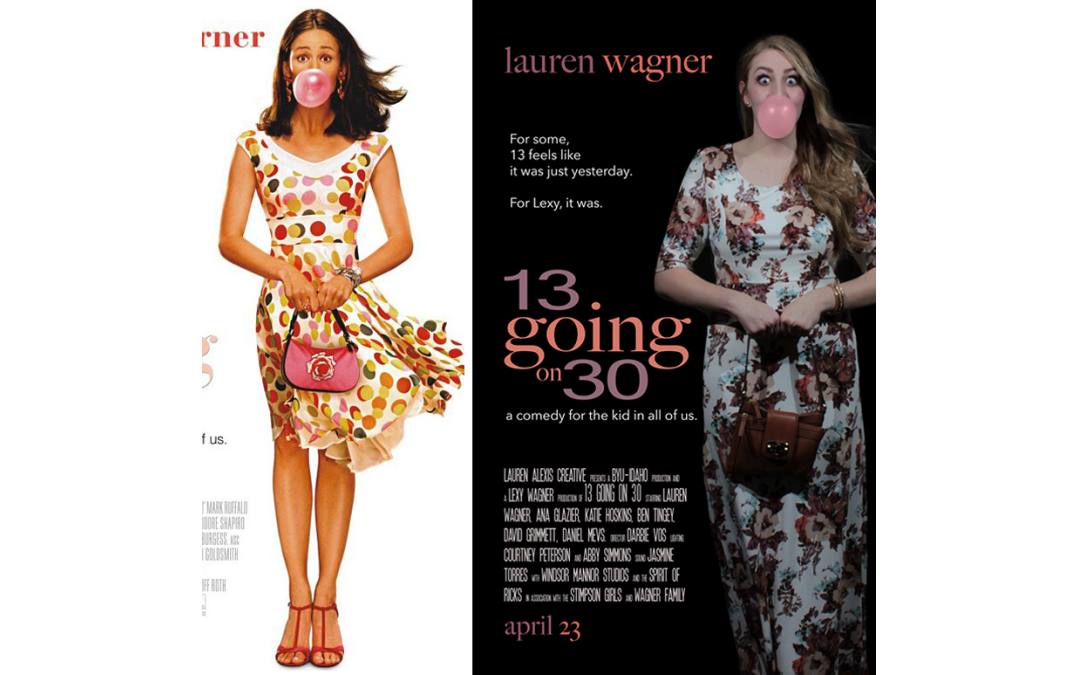
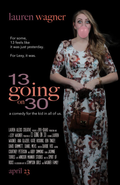
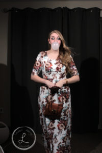
First I had to look at the original movie poster (featured below). I looked at the lighting, the pose, the title, ect. Then I started to think about how I could recreate this. I looked through my closet and found a dress that would be flowy, and then I bought some gum. Which lead to the photo shoot. I knew that I was going to take the background out of the original image so I set up the shot in my living room. I had a fan plugged in laying on the floor at an angle to make my dress blow. I had a roommate with a hair dryer blowing my hair, and two of my other roommates were standing on chairs holding some speedlights and angling them at me. My camera was set up on a tripod with a timer, and there was lots of running back and forth. The hardest part of the whole shoot was blowing the bubble gum. It is hard to blow a perfect bubble, and my roommates joking around did not help at all. On a side note, I might actually hate the taste of bubble gum now.
After the perfect bubble was finally blown and captured on camera (featured below) I took the image to Adobe photoshop. Here I lightened the image a little, changed the color of the gum because it was dull, and I removed the background. Since my dress was white, I figured the image would look better on a black background. I then went into Adobe Illustrator and re-created the logo. I picked colors that were similar to the original poster, but also matched my dress. Then I went back into photoshop and put it all together.


Original Photo

Original Movie Poster
If you want to see some other cool movie poster remakes then you should click here.

by laurenawagner | Jan 15, 2017
Different ways to set up light
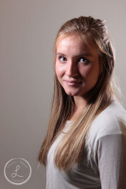
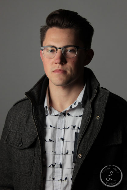
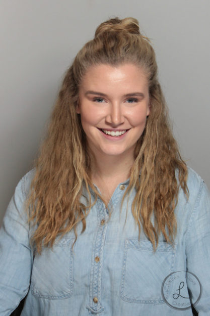
Ever look at a professional photo and wonder why are they so good? Well the trick is all in how you set up the light. It is important to create a triangle of light between the camera, the flash, and the subject. The different angles you set up the light make all the difference. Here are the main lighting patterns:
- Split lighting (90°)
- Rembrandt (45°)
- Loop (25°)
- Butterfly (0°, but above the subject)
- Clamshell (like butterfly but the subject holds a reflector in their lap)
If you want more tips it is a good idea to check out The Digital School of Photography.

Split Lighting

Rembrandt

Loop

Clamshell
